Lines back. Now just the pill.
You liked the values and the lines connecting each pill to the result, so those are back, with the labels dropped and the lines drawn thinner and cleaner onto a small dot at each word. The only thing left to settle is the look of the pill itself, so here are four takes. Pick one and I will wire it into the full flow and the animation. No em dashes.
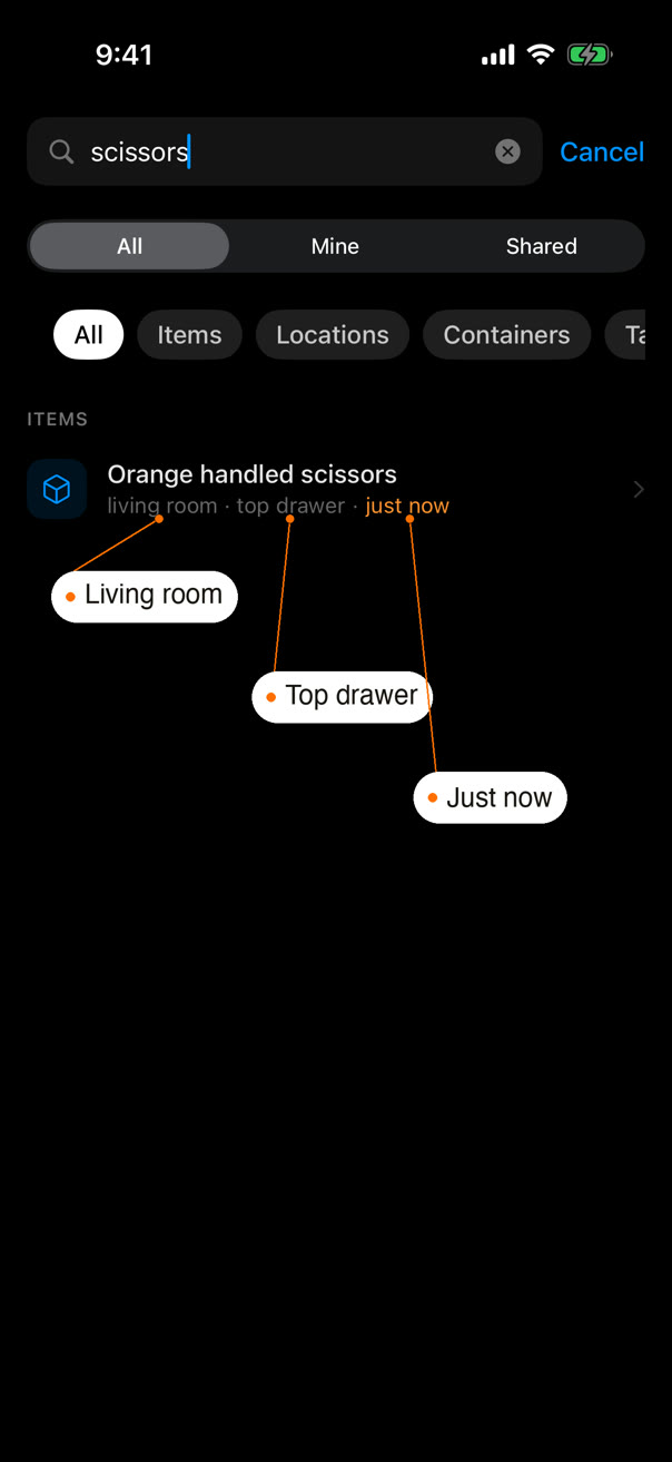
White
Clean white pill, a small orange dot, value in ink. Bright and legible.
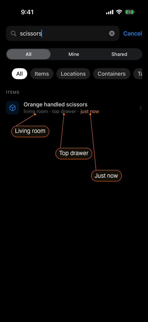
Outline
Dark pill with a thin orange outline, value in white. Quiet, matches the dark search screen.
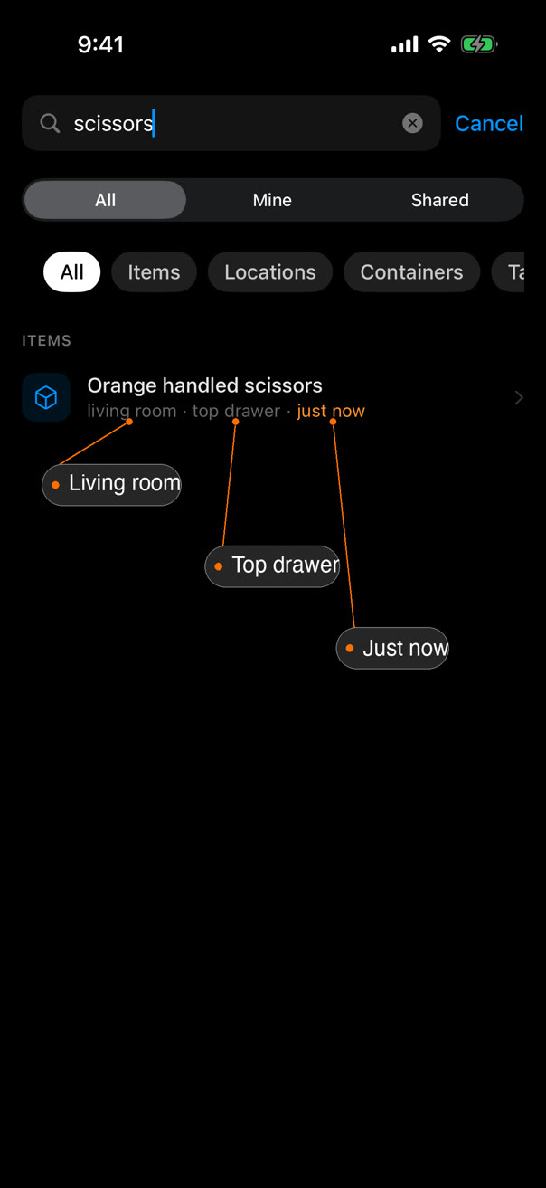
Glass
A soft translucent pill, value in white. The most understated.
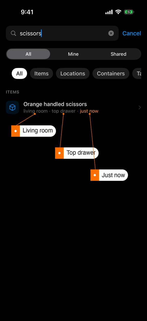
Two-tone
White pill with an orange cap on the left. The most distinct.
Notes
These are still frames of the search result so the pill design reads clearly. The connecting lines now land on a small orange dot at the value in the result ("living room", "top drawer", "just now"), values only, no "location" or "container" labels. Tell me A, B, C or D and I will build the animated version and drop it into the five-screen flow.