Version 2 · 2026-07-17 · Camera-First
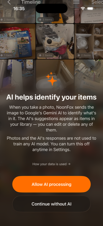
The opposite bet from v1. NoonFox's own promise is that capture is a reflex, not a workflow — so the onboarding should be that. Open the app and you're already in the camera. You learn the product by doing the one thing it's for.
Same brand, inverted mode — the dark, capture-forward world so the contrast with v1 is impossible to miss.
This isn't a demo screen — it's the actual first screen
The thesis
v1 sells the app across several screens before you touch it. v2 argues the fastest path to "I get it" is to skip the selling entirely: the aha for a capture app is snapping something and finding it, and you can deliver that in the first four seconds. The strongest onboarding research agrees the deck is often skipped anyway — NN/g literally says "avoid onboarding whenever possible."
It also pairs cleanly with two of v1's own conclusions: value before signup (Duolingo, +20% DAU) and the reverse-trial paywall — both want the user snapping before any ask. v2 just takes them to their logical extreme.
The flow · 5 beats, almost no screens
Open
No account, no carousel. A single floating line primes the one permission inline: "Point at anything you don't want to lose. We'll remember it." Then the OS camera prompt, with its reason already given.
Snap
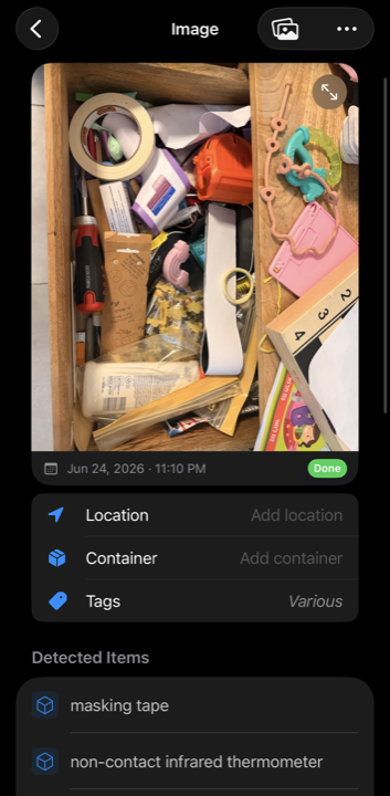
They shoot. The fox reads the shelf and files every item — chips pop in with locations (exactly the live mockup above). One micro-line lands the point: "Filed. That's the whole app."
Find
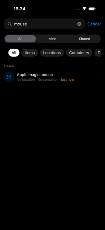
Immediately: "Now ask where it is." A pre-filled search runs against what they just snapped and lands on it. The snap→find loop is closed inside the first session — the dopamine hit for this persona.
Repeat
"Snap two more things — the ones you always lose." Builds the small catalogue that makes the app sticky, with zero forms in the way.
Only now, the ask
After ~3 items and a successful find: "Save these across your phone & family" (one-tap sign-in), then the reverse trial. Segmentation is inferred from what they snapped (tools → garage model), or asked lightly later — never a gate up front.
Note what's gone versus v1: the welcome hero, the use-case carousel, the family-sharing screen, and the upfront "what brings you?" question. They don't disappear — they move to contextual moments and settings, surfaced when they're relevant instead of front-loaded.
Actual app · real captures
Camera-first works because the payoff is real and immediate. This is a genuine screen-recording of the app launching into a full Timeline — no deck needed to explain it.
Actual screen-recording — straight into a real, full Timeline


Be honest
| Camera-First (v2) wins | Camera-First (v2) loses |
|---|---|
| ✓ Fastest possible time-to-aha (~4s); highest first-snap rate | ✗ No room to sell skeptics who need the pitch before they act |
| ✓ Lowest friction — the ADHD / low-patience persona's ideal | ✗ Less "investment" built → the paywall has less earned momentum behind it |
| ✓ The onboarding is the product — perfectly on-brand ("capture is a reflex") | ✗ No upfront segmentation signal to personalize the first run |
| ✓ Nothing to skip, nothing to A/B for length | ✗ Breadth of use-cases (insurance, collections, storage) never gets showcased |
| ✓ Cheapest to build & maintain — barely any screens | ✗ An abrupt camera on open can feel jarring if the priming line is weak |
Pick v2 when…
…the funnel shows people bouncing at the deck; the ADHD segment is a primary target; App Store traffic is already warm (they read the listing, they don't need re-selling); or you want the leanest thing to ship and learn from.
The obvious experiment
These two are a clean A/B: v1 (guided) vs v2 (camera-first), same paywall model, measured on first-snap rate, time-to-first-find, D1 return, and revenue-per-install. A third hybrid could open camera-first but offer a "show me what this does" escape into v1's deck.
Prefer the guided sell? Compare with →
Open v1 · The Guided Flow