Your hand-drawn mechanism diagrams stopped in 2022. Here are five ways to
generate them again, every one drawing the same mechanism, so you are choosing between
styles and not between subjects.
A scan of all 34 published articles turned up a signature that has gone quiet.
`a-team-contract` and `startup-fundraising-playbook`, both 2022, carry hand-drawn
marker-on-white mechanism diagrams with numbered callouts, and the prose then walks the
drawing element by element: "The squiggly line: ... The X: ... The ?: ...". It is the most
distinctive visual thing in the corpus.
Zero of your eleven modern articles contain a single image. Not a diagram, not a
photo, nothing. So the question is not whether to add diagrams. It is which way of making
them is cheap enough that it actually happens every time.
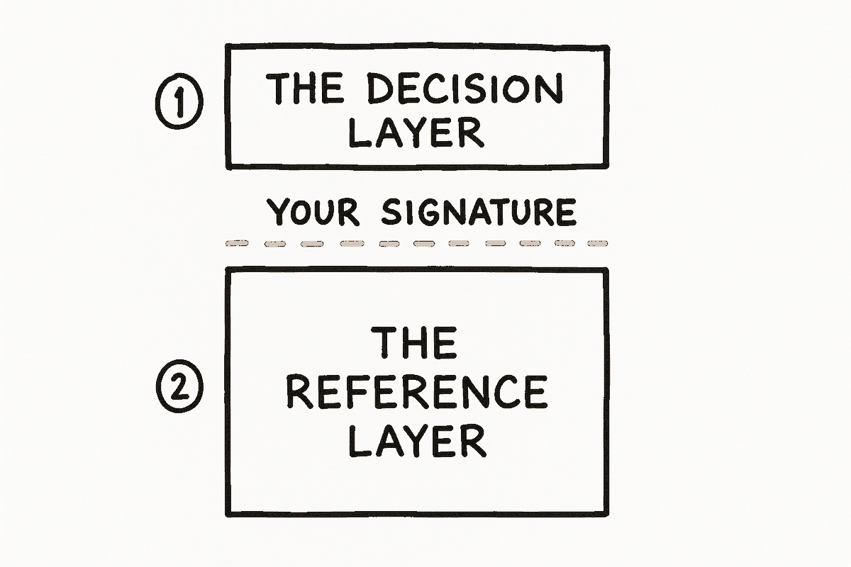
Each option below draws the same thing: the two-layer client update, one email split by
the signature. Judge them side by side, then pick one and it becomes the house treatment in
`FrameworkWritingAdvisor.md`.
The five
OPTION 1
Clean geometric SVG
Live now
How
Hand-written inline SVG. What `clientupdates` v4 ships today.
Cost
Free. Roughly 20 minutes of my time per diagram.
Survives
Everything. No JS, no image, no external file.
The honest problem: it looks like every other consultancy
diagram on the internet. It carries the argument, but it says nothing about who drew it.
OPTION 2
Sketched, typeset labels
Live now
How
The same geometry drawn through rough.js, which is already on the site and already used by the `audiopipeline` topic. A fixed seed makes it identical on every load.
Cost
Free. Same 20 minutes, plus one line to switch the renderer.
Survives
Needs JS at render time, which is why the three sketched diagrams on this page are all served pre-rendered, the way option 4 describes.
Hand-drawn strokes with clean type. The wobble reads as human without
costing any legibility, and it is the cheapest thing on this page to adopt.
OPTION 3
Sketched, handwritten labels
Live now
How
Option 2, with the labels set in a marker face rather than the site's type.
Cost
Free, plus one webfont to self-host (about 30 KB).
Survives
Same as option 2, and the font must be self-hosted for protected topics.
The closest match to your 2022 drawings, because in those the
lettering was hand-done too. The risk is that fully hand-drawn type gets harder to read at
phone width, where most of the reading happens.
OPTION 4
Sketched, then frozen to static SVG
Live now
How
Run option 2 once at build time, export the generated paths, and paste them in as plain SVG. The page then carries drawn strokes with no JavaScript at all.
Cost
Free, plus a small export script I would write once.
Survives
Everything, including the byte-for-byte copy to the Frameworks index and the plain-markdown mirrors.
The technically correct answer. Identical output to option 2 with
none of its fragility. A promoted article must not depend on a script running.
OPTION 5
Generated marker drawing
Real image
How
Image generation from a written description of the mechanism. This is a real generated image, made for this page, not a mockup of one.
Cost
A few cents and about 40 seconds per attempt. Expect two or three attempts.
Survives
It is a PNG, so it copies anywhere, but it cannot be edited. A wording change means regenerating it.
The warmest of the five, and the least controllable. This one came
out clean on the first attempt, which will not always happen: generated images get text
wrong, and the more labels a diagram carries the worse the odds. Good for a three-element
mechanism, bad for anything dense.
My recommendation
Option 4 as the default, option 5 when the piece needs warmth
Option 4 gives the hand-drawn line without asking a promoted article to depend on
JavaScript, and it costs nothing per diagram once the export script exists. It is the same
picture as option 2 with none of the risk.
Option 5 is worth keeping for a piece where the drawing is the point rather than
the explanation, and for anything you would want to look genuinely handmade. Its ceiling is
low on label-heavy diagrams, so treat it as the exception.
Option 3 is the truest revival of your 2022 look and I would still not lead with it,
because handwritten labels are the first thing to fail at 390px.
What I would do next
You pick one, and it becomes the diagram rule in `FrameworkWritingAdvisor.md`, which currently only says "hand-drawn with numbered callouts" without saying how to make one.
I write the generator: for option 4, a script that takes a small description of boxes, labels and arrows and emits the frozen SVG, so a new diagram is minutes rather than an afternoon.
The callout convention comes back with it. Numbered circles in the margin, and the prose walks them in order. That was half of what made the 2022 diagrams work, and it costs nothing.
Optional: a second version of this page drawing a different mechanism, if you want to see how each option holds up on something denser than two boxes.
Every diagram above draws the same mechanism from `The Two-Layer Client
Update`. Options 1 to 4 are rendered live in this page; option 5 is a real generated image.
See the framework it came from