Simplify: three ways
The live noonfox.com had grown to nine sections, two forms, a feature grid, eleven questions and a row of promises that nobody was asking for. Three homepages that keep only what a visitor values, in one order, with the app treated as live on the App Store.
What all three drop from the live site: the twelve-feature grid, the eleven-question FAQ, the "first 60 seconds" section, the proof chips (never sold, no hardware, built by one person), the mission band, the team card, the launch-list forms and the pre-launch status line. What all three add: the official App Store badge, linked, in the header, the hero and the close.
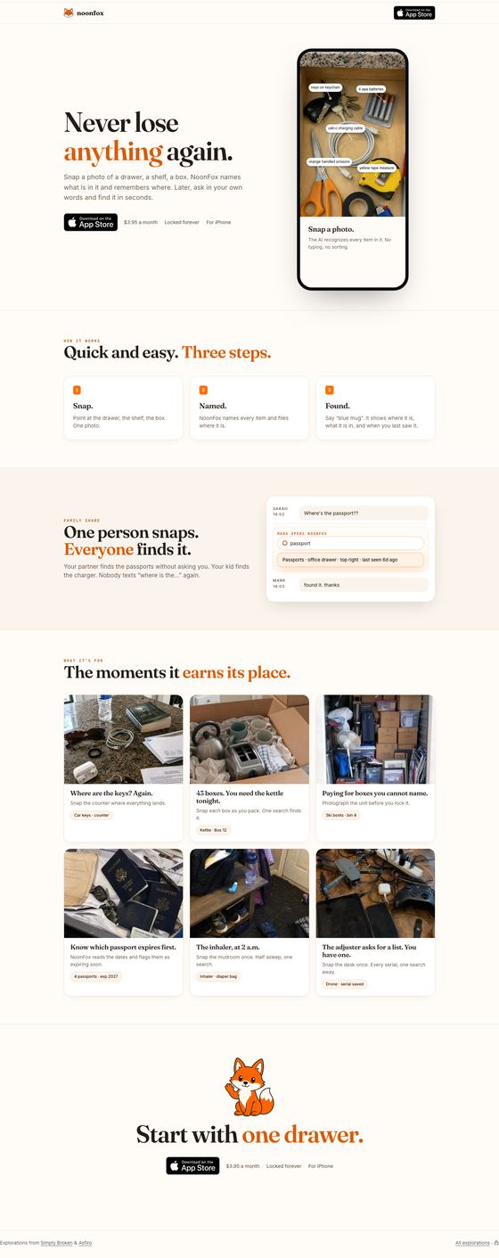
Four beats and nothing else
One screen per beat. The hero is the promise beside the phone; how it works is three cards with one line each; Family Share is one sentence and the search card; the moments are a six-card grid. About a third of the live page's length.
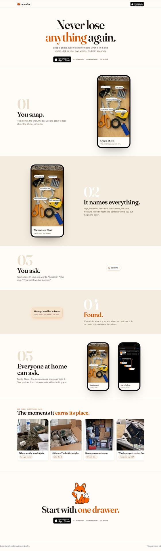
One scroll, one story
The page is the product demo told slowly: you snap, it names everything, you ask, found, and then everyone at home can ask. Big numerals, alternating cream and sand bands, one phone per beat. The moments are a sideways strip at the end.
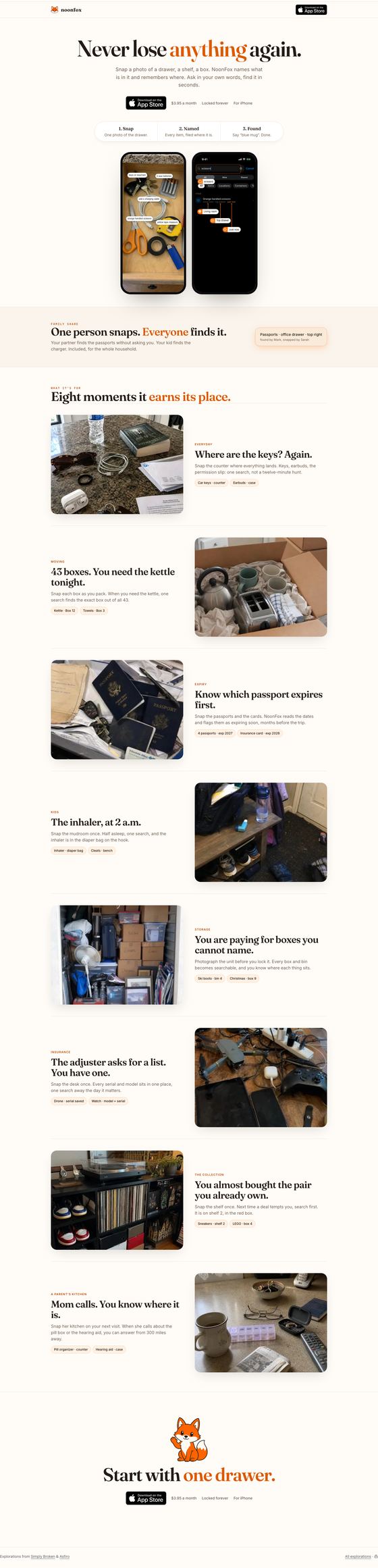
The moments carry the page
Promise, badge and a one-line how it works inside the hero, Family Share as one band, and then the page is the use cases: eight alternating rows of a real photo and one sentence. The reader finds their own life somewhere in the list.
The same four beats, weighted three ways
What did not change, on purpose
Built for the phone first. Each option carries its own phone layout: the badge in a sticky bottom bar, the hero phone sized so the promise, the badge and the product share the first screen, compact step rows, and the moments as photo-and-line rows rather than tall cards. All three were reviewed at a real 390 px width, top to bottom.
Every claim stays inside what ships: NoonFox flags an expiring passport, it never reminds; Family Share is one group where everyone can find and edit; the price is $3.95 a month, locked forever, per person. The photos are the same real-mess scenes, the fox waves once at the close, and the voice stays short and warm. The consent form, the launch list and the pre-launch status line are gone because the brief is a live app; when the site switches over, the badge links to the real listing and nothing else has to move.
Where the CMO lands. Option A for launch week, because the first job of the page is to convert a visitor who arrived from a search or a creator's post, and A gets them to the badge fastest with the product in view. Option C's rows are the better long-term page once traffic is coming from many different lives, and its rows are the natural home for each future custom product page.
Two things to decide by note: whether "For iPhone · iOS 26 and later" belongs under the badge or only in the store, and whether the six moments in A and B should be the same six as C's first six (they are today).