Version 1 · 2026-07-31 · Round 1
The brief was: take the fox emoji everyone already knows, and make him inviting and a little whimsical, a lazy fox who shows up at the edge of a screen and helps you keep your life in order. Ten character directions, spanning emoji-familiar to editorial-restrained. Each one is drawn twice, because a mascot that charms in a single lucky frame is not yet a character.
Read this first
NoonFox already has a fox on paper. Three documents describe him, and they agree: line-driven, confident silhouette, closer to a New Yorker spot illustration than a Saturday-morning mascot. The commission brief goes further and names the failure modes to avoid, including cute-aggressive and any cute fox sticker pack on Etsy.
positioning-brief.md §9/§14, identity-system.md §4 and
fox-commission-brief.md §6 need rewriting to match. Right now they would reject
most of what is on this page.
One thing the docs and the ask already agree on, and this round keeps: one fox, no human clothes, eyes as the soul, and readable when small.
The signature test
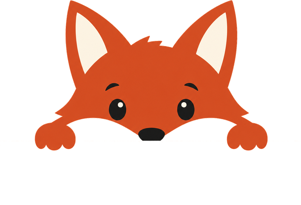
The peeking fox was the specific picture in the brief, so it is the test that matters most. Pick a fox, pick where he leans in from, and see him on an actual onboarding screen at real size. A character that works here works everywhere; a character that only works in a square portrait is a drawing, not a mascot.
Step 2 of 4
One photo. He catalogues what is in it, so you can ask for it later in your own words.
Ten directions, cut out of their backgrounds.
The field
Left image is the settled portrait, the character at rest. Right image is the same direction peeking. Read them as a pair: the gap between the two is how much character survives a change of pose.
The 120px test
A mascot in the corner of a screen is roughly 120 pixels tall. Everything below is the peek pose at exactly that size, on a dark ground so the silhouette has to carry itself. This is where four of the ten separate from the rest.
Holding up: A1 (loudest, the orange does the work), E1 and P1 (bold, uncluttered silhouettes), K1 (quiet but clean). Turning to mush: C1, L1 and S1, all of which spend their detail budget on fur and brow lines that simply are not there at this size.
The unresolved question underneath
The brand has two oranges and they have never been reconciled. The identity system gives the fox Fox Russet. Everything actually shipped, the three production app icons and the v28 site, is Safety Orange. If the mascot is russet and the icon is safety orange, they sit next to each other on a phone looking like two brands.
#C8552DNine of the ten directions. Warmer, more editorial, closer to a real fox. Sits beautifully on cream. Quieter on a busy screen.
#FF6A00Direction A1 only. Matches the shipped icons exactly. Won the 120px test outright. Reads as a brand colour rather than as fur.
Compare A1 against E1 in the field above: near-identical construction, different orange. That pair is the cleanest read on this question anywhere in the round. A likely resolution is a fox in russet with safety orange kept for the icon and the interface, but that is a decision, not a default.
Where this goes
Round 1 converged more than it should have: five of the ten came back as variations on the same friendly vector fox. Round 2 corrects that and tests the thing Round 1 could not.
billing_hard_limit_reached. Raise the cap in the OpenAI billing settings and
Round 2 runs in about four minutes with no further input. Round 1 cost roughly two dollars.
Reproduce any of this from generate_fox.py in the vault record. Round 2's
prompts are already committed there, so the run is a single command.