NoonFox Explorations
← NoonFox App Icon tracker

Version 3 · 2026-07-17 · Round 3 — perfecting E, then the plot twist

You picked E. Then we checked the neighbors.

Round 3 did two things: perfected your pick (seven one-variable variations on E1a) — and ran a competitive-field check against 27 real App Store icons. The check found something that matters: a live competitor already owns E's composition, in blue. The round therefore ends with E at its best, the evidence, and one new hybrid built to keep E's warmth without the collision.


The evidence first

iFoundIt is already on the shelf, in blue

Real App Store artwork, pulled today. iFoundIt: Home Inventory — a direct competitor, live now — uses the same composition as the E family: white house, magnifying glass knocked out inside, glass tilted the same way. Legally this is fine (generic elements, different color). But in a "home inventory" search results list, E reads as iFoundIt in orange.
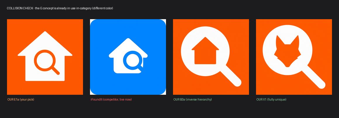
Side by side: our E1a, the iFoundIt competitor icon in blue, our B3a, and our X1 — showing E1a and iFoundIt share the same composition.

The full 27-icon field (every findable home-inventory app + the orange/house/search risk zone) confirmed the flip side: no home-inventory app uses orange at all, and nothing anywhere resembles B3a (house inside the lens) or the fox marks. The orange field remains entirely yours.
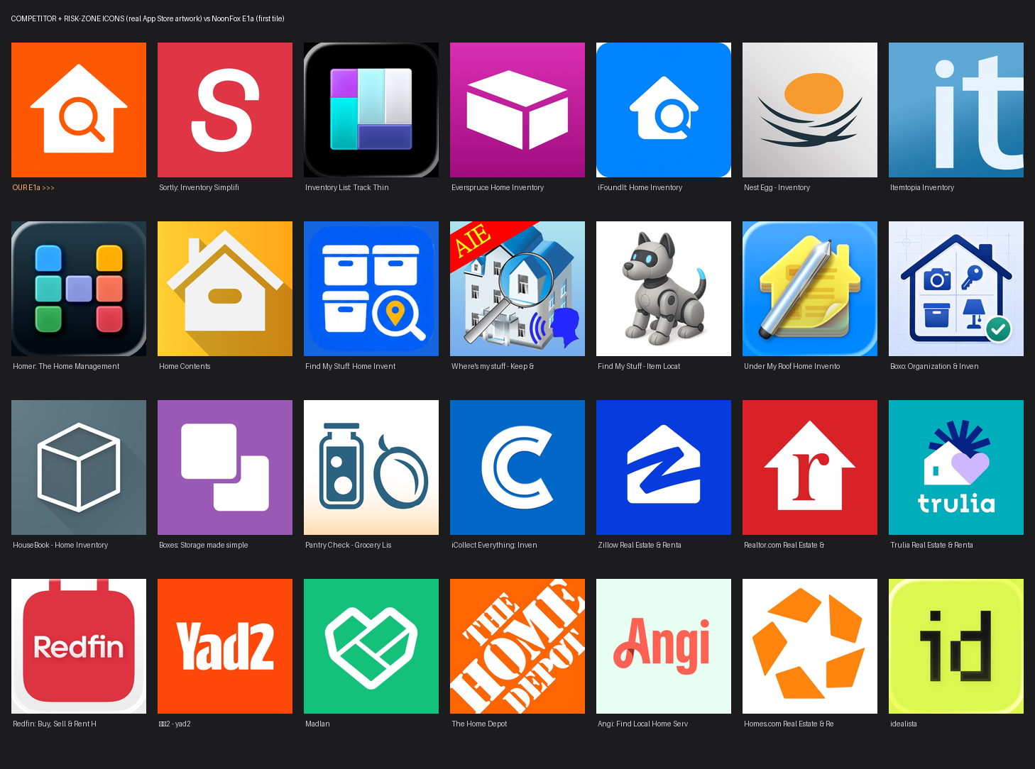

Grid of 27 real competitor and adjacent-category app icons next to NoonFox E1a.

The E duels

E1a perfected — seven one-variable variations

Each changes exactly one thing from your pick. If E survives the collision question, E2c is its best form.

E1a anchor
E1a ANCHOR

Your pick, unchanged

The wide-roof original from round 2 — the reference every variant is judged against.

60 px
29 px
E2c
E2c BEST E

Thicker ring

The bolder glass gives the strongest "search" punch at 29 px of any E. If you stay with E, this is the one.

60 px
29 px
E2a
E2a KEEP

Glass at 49%

The midpoint between E1a and E1b — balanced, clean, no downside.

60 px
29 px
E2b
E2b WATCH

Glass lower

Sits more naturally in the body, but the difference from E2a is marginal.

60 px
29 px
E2e
E2e WATCH

Cozy wide body

Squat and warm — the most "home" of the set, at a small cost in glass size.

60 px
29 px
E2d
E2d SKIP

Taller house

More presence, but the roof narrowed and lost the archetypal gable that made E1a work.

60 px
29 px
E2f
E2f SKIP

Softer corners

Friendly, but the glass shrank and the silhouette went vague — loses at 29 px.

60 px
29 px
E2g
E2g SKIP

Handle breaks out

The wildcard executed — but the two-tone handle reads like a wand crossing a wall. Clever, not clear.

60 px
29 px

The new hybrid

X2 — the fox is in the house

X2: white house with an orange fox head knocked out inside
X2 NEW FINALIST

E's warmth, zero collision

Your E house — but with the fox knocked out instead of the borrowed real-estate glass. Says "NoonFox lives in your home." Unique everywhere, warm, and instantly readable. The trade: like X1, it gives up the literal "search" symbol.

60 px true
29 px · real pixels

Where this leaves the decision

Four finalists, three stories

B3a
B3a

"Find things in your home" — clearest category read, clean field

X2
X2

"The fox is in the house" — E's warmth, fully ownable

X1
X1

"NoonFox finds things" — boldest brand mark

E2c
E2c

Best E — if the iFoundIt overlap doesn't bother you

My recommendation after the field check: B3a for the App Store (nobody owns its composition, and it says exactly what the app does) or X2 if the icon should feel like the brand's home. E2c stays on the table with eyes open — the overlap with iFoundIt is aesthetic, not legal.

How to finish

One word ships it

final: B3a ← or X2 / X1 / E2c
→ Recraft vectorize → exact #FF6A00 → 1024 master + all sizes
→ Icon Composer (Mac) → light / dark / tinted .icon → Xcode

Masters: candidates/round-3/ · competitor artwork: eval/competitor-icons/ · Round-3 cost ≈ $0.55, total ≈ $1.85.